Purple Pairing, No Clash

Mason O'Donnell
| 27-08-2026
 · Lifestyle Team
Hi, readers. Purple is the color people love to buy and then struggle to wear.
You grab a lilac knit, a deep plum skirt, and suddenly you're wondering if the whole outfit reads as "costume" instead of "put-together." The good news?
The fix isn't about adding more colors. It's about learning how to stack the same color family so the shades talk to each other instead of fighting.
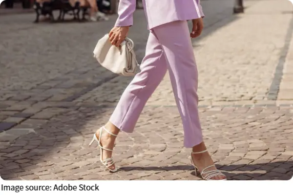
Start with undertone, not shade
The first thing to check is whether your purple leans warm or cool. A warm purple has a reddish or brownish base, like a ripe fig. A cool purple tilts toward blue, like a periwinkle or a frozen grape. If you mix a warm plum top with a cool violet skirt, they'll look muddy next to each other no matter how close the depth is. Try holding two pieces side by side in daylight. If one feels "redder" and the other feels "bluer," they belong in different outfits.
Pick three depths, not ten
You don't need a gradient rainbow. A tonal outfit works best with three distinct values: one light, one medium, one deep. Think a soft lavender blouse, a mid-tone iris trouser, and a dark aubergine shoe or bag. That spread gives the eye a clear path to travel, and it keeps the look intentional. If everything sits at the same middle depth, the outfit flattens out and reads as one big blur. The contrast between the light and the deep is what makes the medium shade pop.
Use one neutral as a buffer
If you're nervous about going full purple, let one neutral piece break the color blocks. A cream coat or a charcoal belt between a lilac top and a plum skirt stops the shades from bleeding into each other. This works especially well around the face. If you have a pale lavender blouse, a warm beige cardigan or a tan leather jacket keeps your skin from picking up a grayish cast. White works too, but it can make cool purples look icy, so test it in natural light first.
Texture does the heavy lifting
Same color family, different fabrics, and suddenly the whole thing feels expensive. A matte cotton tee in dusty mauve under a slick satin blazer in deep plum gives you contrast without adding a single new hue. The light catches the satin and skips the cotton, so your eye reads dimension even though the palette is narrow. Knitwear is your friend here too. A chunky cable-knit sweater in heather purple paired with a smooth silk skirt in a darker violet creates that same layered effect. Avoid pairing two flat, same-finish fabrics in similar depths, because that's the combo that ends up looking like a uniform.
Let accessories set the tone
If your whole outfit is mid-tone purple, your accessories should go either much lighter or much darker. A pale lilac handbag against a plum coat gives you a bright focal point. A deep eggplant boot with a lavender dress grounds the look and keeps it from floating. Metallics work if you pick the right one. Silver pairs best with cool purples, and gold warms up a reddish plum. Bronze is the wildcard that suits most purples because it sits between the two. For a quick test, hold a silver spoon and a gold ring near your wrist. Whichever makes your skin look less sallow is your match.
When in doubt, go darker on bottom
The safest tonal formula is simple: lighter on top, darker on the bottom. A lilac or orchid top with a deep plum or aubergine bottom always looks grounded. It mirrors how light falls naturally, and it keeps the eye moving downward in a pleasant way. You can flip it if you want drama, like a dark burgundy-purple top with a pale wisteria skirt, but that draws attention upward and can wash out lighter skin tones. If you try it, add a darker lip or a deep scarf near your face to anchor things.
So next time you stand in front of your closet holding two purples, stop asking "do these match?" and start asking "are they the same undertone, and are they far enough apart in depth?" That single question will save you more outfit fails than any color wheel ever will. Go pull out that lilac shirt you've been avoiding, and give it a proper partner.